
User's Manual

FutureWaves™ User Manual
FutureWaves™ v1.7.0.1
20
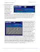
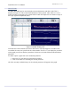
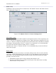
The green-line to the left
is what the system
predicted for a time, as
selected by yellow-
circled drop-down menu,
before the motion
occurred. In this
example it is set to the
30-second prediction.
Since this value can
change with each
subsequent system forecast output, if forecast-to-forecast values are inconsistent there will be
discontinuities in this line. This area to the left of the time-domain plot also shows what was
measured for the selected ship motion of interest by the ship motion sensor (SMS) as the red-
line. Comparing the red-line to the green-line in this section of the display provides one
assessment of forecast performance.
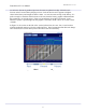
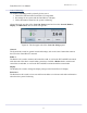
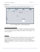
The additional white and purple lines
on the right on the Time Series plot in
Figure 20 depict statistics of the
predictions produced up to that point
in the forecast timeline. The white-
line is a plot of the average value of
the signal envelope for each forecast
at the point in the time series. For
this example, the white-vertical-
double-arrow-line in the figure, which
is not plotted by the system but is
annotated here for explanatory
purposes, represents all the
predictions produced up to ‘now’ for
a time 25s into the future. The white-
dashed arrow points to the plotted
white-line at 25s in the prediction
window, and this plotted white-line is
an estimate of the predicted roll 25s
from ‘now’. Since we are averaging values for times along the prediction window, we also have
a variation of these values which is indicated by the plotted purple-line. The purple-line
represents one standard deviation added to the average value. If predictions are consistent from
forecast-to-forecast, the purple-line is closer to the white-line. When a confidence level is
chosen in the Operational Forecast panel, this is selecting the factor for adding sigma to the
predicted values to minimize probability of exceeding a threshold.
Figure 19:
Micro
-
Forecast Panel
Example Part 1
Figure 20:
Micro-Forecast Panel
Example Part 2