
Computer Network Router User Manual

CHAPTER 3
Controls
3-18 Checkboxes
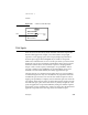
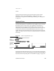
To operate a radio button the user can tap any part of it, including the text or
picture that identifies it. Tapping one button in a cluster turns off whichever
button was on before.
A cluster of radio buttons must contain at least two items. Instead of using a
single radio button, use a checkbox (see the next section, “Checkboxes”). At the
opposite extreme, a cluster shouldn’t contain more than seven radio buttons. A
large cluster of radio buttons simply takes up too much space on the screen.
Rather than a lot of radio buttons, use a picker (see Chapter 4, “Pickers”).
A cluster of radio buttons always has the same set of choices. It never changes
contents depending on the context. If more than one group of radio buttons is
visible at one time, the groups need to be visually separate from each other.
Each cluster may have a heading to identify it.
Radio buttons and cluster headings are usually capitalized like book titles.
However, in some contexts it makes more sense to capitalize them like
sentences. If the radio button text completes a sentence begun by the label of
the radio button cluster, the heading should be capitalized like a sentence
and the radio buttons should be all lowercase (except for proper nouns).
Avoid punctuation in radio buttons and cluster headings. In particular, do
not end a cluster heading with a colon. The heading’s meaning is clear
without the colon.
Checkboxes 3
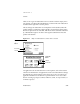
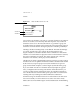
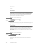
Checkboxes, like radio buttons, provide alternative choices for users. A
checkbox is a small dotted box that may include a check mark (✔). It is labeled
to the right or left with a word or phrase. Use a checkbox to indicate an option
that must be either off or on.
The user selects or deselects the checkbox by tapping it or its label. When the
option is selected, a check mark appears in the box. When the option is not
selected, the box is empty. Checkboxes act like toggle switches, which can be
on or off. A checkbox is on when it is selected and off when it is not selected.
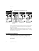
Figure 3-18 shows some typical checkboxes.