
Computer Network Router User Manual

CHAPTER 3
Controls
3-8 Buttons
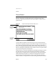
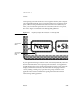
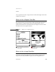
its picture has an unbroken line around it—a sort of self-border. Figure 3-8
shows where you should omit picture button borders and where you should
keep the borders.
Figure 3-8 Where to use borders with small, self-bordered picture buttons
Designing Picture Buttons 3
Picture buttons are tempting to use because they are more compact than text
buttons. But designing an unambiguous picture small enough for a picture
button is very hard. A button’s function may be more evident if you label it
with a short name instead of a picture.
Avoid pictures that look like the buttons of other applications, such as
Names and Dates. Users may think your look-alike button will open the
corresponding built-in application, and may be confused if your buttons do
something else.
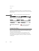
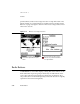
Avoid borders on a separator bar, but use
them on a status bar or at the bottom of a slip
Don’t add borders to self-bordered buttons on
a separator bar, and don’t omit them on a
status bar or at the bottom of a slip