
User guide

90
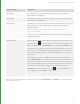
Type Description Options
Mapping Pop-up
Menu
Used to define a drop-down
menu, and return a different
value to the one shown in the
selected menu entry. For
example, to show a Yes / No
Boolean menu, but return 0 or
1, map the numbers 0 and 1
to the string menu entries Yes
and No.
Constant (No Animation)
• Can be True or False. If True, values entered in the
widget are keyable.
Display Only
• Can be True or False. If True, the widget displays, but
without function.
Pop-up Options
• Used to add or delete entries from the pop-up menu, and
set mapping. Add entries by selecting Add > New Entry.
Each entry has two fields, the field displayed in the pop-
up menu, and the field returned when the menu option is
selected. The field displayed in the menu is the leftmost
one.
Check Box Returns a Boolean value,
depending on whether the
box is checked or not. Used as
a value in conditional
arguments on other widgets
(such as Conditional Visibility,
and Conditional Locking).
Constant (No Animation)
• Can be True or False. If True, values entered in the
widget are keyable.
Display Only
• Can be True or False. If True, the widget displays, but
without function.
TeleParameter A parameter that references
another parameter. The UI
provides a drop zone, to drag
parameters onto. This creates
a Python expression
referencing the dropped
parameter. In practice this
means that a TeleParameter
takes on a variable type
matching the dropped
parameter.
Constant (No Animation)
• Can be True or False. If True, values entered in the
widget are keyable.
Display Only
• Can be True or False. If True, the widget displays, but
without function.
Color Offers the user a color picker
dialog, with tabs for RGBA,
HSL, and HSV color schemes.
12 USER PARAMETERS AND WIDGET TYPES | WIDGET TYPES