
Operation Manual
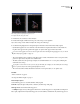
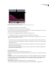
Table Of Contents
- Contents
- Chapter 1: Getting started
- Chapter 2: Digital audio fundamentals
- Chapter 3: Workflow and workspace
- Chapter 4: Setting up Adobe Audition
- Chapter 5: Importing, recording, and playing audio
- Chapter 6: Editing audio files
- Displaying audio in Edit View
- Selecting audio
- Copying, cutting, pasting, and deleting audio
- Visually fading and changing amplitude
- Working with markers
- Creating and deleting silence
- Inverting and reversing audio
- Generating audio
- Analyzing phase, frequency, and amplitude
- Converting sample types
- Recovery and undo
- Chapter 7: Applying effects
- Chapter 8: Effects reference
- Amplitude and compression effects
- Delay and echo effects
- Filter and equalizer effects
- Modulation effects
- Restoration effects
- Reverb effects
- Special effects
- Stereo imagery effects
- Changing stereo imagery
- Binaural Auto-Panner effect (Edit View only)
- Center Channel Extractor effect
- Channel Mixer effect
- Doppler Shifter effect (Edit View only)
- Graphic Panner effect
- Pan/Expand effect (Edit View only)
- Stereo Expander effect
- Stereo Field Rotate VST effect
- Stereo Field Rotate process effect (Edit View only)
- Time and pitch manipulation effects
- Multitrack effects
- Chapter 9: Mixing multitrack sessions
- Chapter 10: Composing with MIDI
- Chapter 11: Loops
- Chapter 12: Working with video
- Chapter 13: Creating surround sound
- Chapter 14: Saving and exporting
- Saving and exporting files
- Audio file formats
- About audio file formats
- 64-bit doubles (RAW) (.dbl)
- 8-bit signed (.sam)
- A/mu-Law Wave (.wav)
- ACM Waveform (.wav)
- Amiga IFF-8SVX (.iff, .svx)
- Apple AIFF (.aif, .snd)
- ASCII Text Data (.txt)
- Audition Loop (.cel)
- Creative Sound Blaster (.voc)
- Dialogic ADPCM (.vox)
- DiamondWare Digitized (.dwd)
- DVI/IMA ADPCM (.wav)
- Microsoft ADPCM (.wav)
- mp3PRO (.mp3)
- NeXT/Sun (.au, .snd)
- Ogg Vorbis (.ogg)
- SampleVision (.smp)
- Spectral Bitmap Image (.bmp)
- Windows Media Audio (.wma)
- Windows PCM (.wav, .bwf)
- PCM Raw Data (.pcm, .raw)
- Video file formats
- Adding file information
- Chapter 15: Automating tasks
- Chapter 16: Building audio CDs
- Chapter 17: Keyboard shortcuts
- Chapter 18: Digital audio glossary
- Index

ADOBE AUDITION 3.0
User Guide
93
vertical line; a completely out-of-phase stereo waveform appears as a diagonal line descending from left to right; a
typical stereo waveform appears as many wavy lines descending from right to left; and a stereo waveform with wide
separation appears as many wavy lines extending in all directions.
• Mid/Side Rotates the Left/Right display to the left by 45˚. The horizontal ruler (x-axis) plots the side channel
([right - left]/2) while the vertical ruler (y-axis) plots the mid channel ([right + left]/2).
• Spin Displays amplitude rather than phase, redrawing the waveform on an axis that rotates in the phase graph.
• Histogram (Log Zoom) Displays the default circular histogram.
• Histogram (Log Full) Similar to Histogram (Log Zoom), but displays the entire range. This option is useful for
viewing pure mono at the edges of the graph.
• Histogram (Linear) Similar to Histogram (Log Zoom), but displays the graph on a linear (rather than logarithmic)
scale. You may notice larger jumps and variations when using this option because of the linear scale. Click Normalize
to constrain the display to the full screen.
• Phase Wheel Displays the phase of individual frequencies. Higher frequencies appear toward the outer edge of the
graph.
Samples Defines the number of samples displayed concurrently. Higher sample sizes give you more accurate results,
but they require much more processing power to be effective. Choose the sample size that best suits your system.
Additional display options for Histogram modes Right-click the graph and select from the following options:
• Show Tracers Displays blue and red tracer lines that help you see in- and out-of-phase audio, respectively.
• Show Ball Displays a ball that shows the overall stereo and phase location of audio. The ball turns red for
out-of-phase audio, green for in-phase audio, and yellow for borderline audio.
• Modulate By Amplitude Changesthesizeofthephasegraphicrelativetoamplitude.Whenthisoptionisselected,
the phase graphic shrinks for quiet audio and gets larger for loud audio.
• Show Labels Displays the Mono, Left, Right, and Inverse axis labels.
• Show Peaks Displays a yellow line that slowly contracts from the highest recent peak.
• Show Valleys Displays a purple line that slowly expands from the lowest recent valley.
• Static Peaks and Valleys Displays the absolute peak and valley since the start of audio playback.
Additional display option for Spin mode Right-click the graph and select Edit Spin Rate to change the speed of
rotation.
Analyze frequency range
In Edit View, you can use the Frequency Analysis panel to identify problematic frequency bands, which you can then
correct with a filter effect. In this panel, the horizontal axis represents frequency (measured in Hz), while the vertical
axis represents amplitude (measured in decibels).
To save or print a Frequency Analysis graph, press Alt+PrtScn, and then paste into an image-editing application.