
Operation Manual


Table Of Contents
- Legal notices
- Contents
- Chapter 1: What's new
- New features summary
- Integration with Creative Cloud Libraries
- Integration with Adobe Stock
- Responsive design enhancements
- Bootstrap enhancements
- Support for Bootstrap v3.3.5
- Duplicate rows and columns
- Enhancements to Bootstrap document creation workflow
- Enhancements to Visual Media Query
- Highlight for the current breakpoint values
- Enhancements to add media query workflow
- Enhancements to editing of breakpoints
- Display of line number in the Go To Code option
- Enhancements to Extract
- Enhancements to Live view editing
- In-app updates
- Testing server - workflow improvements
- Selection-based code collapse
- CSS Designer enhancements
- Undo/redo specific to active documents
- Improvements to the DOM panel
- Reset option for new feature guides
- Update to W3C Validator
- Support for SVG files in the Assets panel
- Change in Zooming options
- Changes in View menu
- Faster syncing of Dreamweaver settings with Creative Cloud
- Deprecated CSS Styles panel and APIs
- New features summary
- Chapter 2: Workspace and workflow
- Dreamweaver workflow and workspace
- Dreamweaver workflow overview
- Workspace layout overview
- Workspace elements overview
- Document window overview
- Document toolbar overview
- Standard toolbar overview
- Browser Navigation toolbar overview
- Coding toolbar overview
- Status bar overview
- Property inspector overview
- Insert panel overview
- Files panel overview
- CSS Designer
- Visual guides overview
- Customizing the Dreamweaver workspace
- Manage windows and panels
- Save and switch workspaces
- Display tabbed documents (Dreamweaver Macintosh)
- Turn on color icons
- Hide and display the Dreamweaver Welcome screen
- About customizing Dreamweaver in multiuser systems
- Set General preferences for Dreamweaver
- Set Fonts preferences for documents in Dreamweaver
- Customize Dreamweaver highlighting colors
- Restore default preferences
- Working in the Document window
- Using toolbars, inspectors, and context menus
- Use the Insert panel
- Hide or show the Insert panel
- Show the buttons in a particular category
- Display the pop-up menu for a button
- Insert an object
- Bypass the object-insertion dialog box and insert an empty placeholder object
- Modify preferences for the Insert panel
- Add, delete, or manage items in the Favorites category of the Insert panel
- Insert objects using buttons in the Favorites category
- Display the Insert panel as a horizontal Insert bar
- Return the horizontal Insert bar to a panel group
- Show horizontal Insert bar categories as tabs
- Show horizontal Insert bar categories as a menu
- CSS Designer panel
- DOM panel
- Search files based on filename or content | Mac OS
- Zoom in and out
- Keyboard shortcuts
- Optimizing the workspace for visual development
- CEF integration
- Dreamweaver workflow and workspace
- Chapter 3: Site management
- About Dreamweaver sites
- About dynamic sites
- Set up a local version of your site
- Connect to a remote server
- Manage Sites dialog box options
- Set up a testing server
- Version Control and Advanced settings
- Import and export Dreamweaver site settings
- Edit an existing remote website
- Set site preferences for transferring files
- Specify proxy server settings
- Chapter 4: File management
- Creating and opening documents
- About creating Dreamweaver documents
- Dreamweaver file types
- Create a layout using a blank page
- Create a blank template
- Create a page based on an existing template
- Create a page based on a Dreamweaver sample file
- Create other kinds of pages
- Save and revert documents
- Set default document type and encoding
- Converting HTML5 to an older doctype
- Set the default file extension of new HTML documents
- Open and edit existing documents
- Open Related Files
- Open Dynamically-Related Files
- Clean up Microsoft Word HTML files
- Managing files and folders
- About managing files and folders
- Using the Files panel
- View files and folders
- Open or close the Files panel
- Search files in the files panel (Mac OS, Creative Cloud users only)
- Expand or collapse the Files panel (Dreamweaver sites only)
- Change the size of the view area in the expanded Files panel
- Change the site view in Files panel (Dreamweaver sites only)
- View files outside of a Dreamweaver site
- Work with files in the Files panel
- Find files in your Dreamweaver site
- Find an open file in your site
- Locate and select checked out files in a Dreamweaver site
- Find a selected file in your local or remote site
- Locate and select files that are newer in the local site than in the remote site
- Locate and select files that are newer in the remote site than in the local site
- Find recently modified files in your site
- Identify and delete unused files
- Access sites, a server, and local drives
- Customize the file and folder details displayed in the expanded Files panel
- Getting and putting files to and from your server
- Checking in and checking out files
- About the Check In/Check Out system
- Set up the Check In/Check Out system
- Check files into and out of a remote folder
- Use WebDAV to check in and check out files
- Use Subversion (SVN) to get and check in files
- Set up an SVN connection
- Get the latest versions of files
- Commit files
- Update status of files or folders in the repository
- Update status of local file or folders
- View revisions for a file
- Lock and unlock files
- Add a new file to the repository
- Move, copy, delete, or revert files
- Resolve conflicting files
- Go offline
- Clean up a local SVN site
- About moving files and folders in Subversion-controlled sites
- Synchronizing files
- Comparing files for differences
- Cloaking files and folders in your Dreamweaver site
- Storing file information in Design Notes
- Testing your Dreamweaver site
- Creating and opening documents
- Chapter 5: Layout and design
- Using visual aids for layout
- Using Frames
- How frames and framesets work
- Deciding whether to use frames
- Nested framesets
- Work with framesets in the Document window
- Create frames and framesets
- Select frames and framesets
- Open a document in a frame
- Save frame and frameset files
- View and set frame properties and attributes
- View and set frameset properties
- Control frame content with links
- Provide content for browsers without frame support
- Using JavaScript behaviors with frames
- Laying out pages with CSS
- Work with Bootstrap files
- Visual Media Queries
- Responsive design using fluid grid layouts
- Presenting content with tables
- About tables
- Table formatting precedence in HTML
- About splitting and merging table cells
- Insert a table and add content
- Import and export tabular data
- Select table elements
- Set table properties
- Set cell, row, or column properties
- Use Expanded Tables mode for easier table editing
- Format tables and cells
- Resizing tables, columns, and rows
- Resize a table
- Change a column’s width and keep the overall table width
- Change a column’s width and maintain the size of the other columns
- Change a row’s height visually
- Make column widths in code consistent with visual widths
- Clear all set widths or heights in a table
- Clear a column’s set width
- Enable or disable table and column widths and menus
- Add and remove rows and columns
- Split and merge cells
- Copy, paste, and delete cells
- Nest tables
- Sort tables
- Using jQuery UI widgets in Dreamweaver
- Using jQuery effects in Dreamweaver
- Colors
- Chapter 6: CSS
- Understanding Cascading Style Sheets
- CSS Designer panel
- Set CSS Styles preferences
- Create a CSS rule
- Set CSS properties
- Edit a CSS rule
- Add a property to a CSS rule
- Apply, remove, or rename CSS class styles
- Move/export CSS rules
- Convert inline CSS to a CSS rule
- Link to an external CSS style sheet
- Edit a CSS style sheet
- Format CSS code
- Disable/Enable CSS
- Inspect CSS in Live view
- Check for cross-browser CSS rendering issues
- Run a browser compatibility check
- Select the element affected by a found issue
- Jump to the next or previous found issue in the code
- Select browsers for Dreamweaver to check against
- Exclude an issue from the browser compatibility check
- Edit the Ignored Issues list
- Save a browser compatibility check report
- View a browser compatibility check report in a browser
- Open the Adobe CSS Advisor website
- Use Design-Time style sheets
- Working with div tags
- Insert and edit div tags
- CSS layout blocks
- Working with AP elements
- About AP elements in Dreamweaver
- HTML code for AP Div elements
- Insert an AP Div
- Draw a single AP Div or multiple AP Divs consecutively
- Insert an AP Div at a particular place in the document
- Place the insertion point in an AP Div
- Show AP Div borders
- Hide AP Div borders
- Work with nested AP Divs
- Draw a nested AP Div
- Insert a nested AP Div
- Nest AP Divs automatically when you draw an AP Div inside another AP Div
- View or set AP element preferences
- View or set properties for a single AP element
- View or set properties for multiple AP elements
- Select multiple AP elements
- View and set properties for multiple AP elements
- AP Elements panel overview
- Select AP elements
- Select an AP element in the AP elements panel
- Select an AP element in the Document window
- Select multiple AP elements
- Change the stacking order of AP elements
- Change the stacking order of AP elements using the AP Elements panel
- Change the stacking order of AP elements using the Property inspector
- Show and hide AP elements
- Change AP element visibility
- Change the visibility of all AP elements at once
- Resize AP elements
- Resize an AP element
- Resize multiple AP elements at once
- Move AP elements
- Align AP elements
- Converting AP elements to tables
- Convert between AP elements and tables
- Convert AP elements to a table
- Convert tables to AP Divs
- Prevent AP element overlaps
- Apply gradients to background
- CSS3 transition effects
- Use Dreamweaver sample style sheets
- The CSS Styles panel
- Chapter 7: Page content and assets
- Set page properties
- Set CSS link properties for an entire page
- Set CSS heading properties for an entire page
- Set title and encoding properties for a page
- Use a tracing image to design apage
- Understanding document encoding
- Select and view elements in the Document window
- Zoom in and out
- Set download time and size preferences
- Working with text
- Arabic and Hebrew text
- Edit in Live View
- Element Display
- Quick Property Inspector
- Live View Property Inspector
- Edit HTML attributes
- Edit text directly in Live View
- Insert elements directly in Live View
- Marquee selection
- Selection and dragging-and-dropping of elements
- Keyboard navigation in Live View
- Disable editing in Live View
- Unsupported scenarios
- DOM panel
- Set text properties in the Property inspector
- Spell check a web page
- Import tabular data
- Import Microsoft Office documents (Windows only)
- Create a link to a Word or Excel document
- Use HTML Formatting
- Use horizontal rules
- Modify font combinations
- Add Edge Web Fonts to the Font list
- Insert dates
- Working with assets
- Creating and managing a list of favorite assets
- Insert and edit images
- Adding media objects
- Insert and edit media objects
- Start an external editor for media files
- Specify the editor to start from Dreamweaver
- Use Design Notes with media objects
- Insert Shockwave movies
- Add video (non-FLV)
- Insert plug-in content
- Troubleshooting plug-ins
- Insert an ActiveX control
- Insert a Java applet
- Using behaviors to control media
- Use parameters to control media objects
- Adding video
- Insert HTML5 video
- Inserting SWF files
- Adding web widgets
- Adding Sound
- Insert HTML5 audio
- Automating tasks
- About assets and libraries
- Working with library items
- Working with Photoshop and Dreamweaver
- About Photoshop integration
- About Smart Objects and Photoshop-Dreamweaver workflows
- Create a Smart Object
- Update a Smart Object
- Update multiple Smart Objects
- Resize a Smart Object
- Edit a Smart Object’s original Photoshop file
- Smart Object states
- Copy and paste a selection from Photoshop
- Edit pasted images
- Setting Image Optimization dialog box options
- Chapter 8: Linking and navigation
- About linking and navigation
- Linking
- Linking files and documents
- Attaching JavaScript behaviors to links
- Link to documents using the Property inspector
- Link to documents using the Point-To-File icon
- Add a link using the Hyperlink command
- Set the relative path of new links
- Link to a specific place in a document
- Create an e-mail link
- Create null and script links
- Update links automatically
- Change a link sitewide
- Test links in Dreamweaver
- Jump menus
- Navigation bars
- Image maps
- Troubleshooting links
- Chapter 9: Previewing
- Chapter 10: Coding
- General information about coding in Dreamweaver
- Setting up your coding environment
- Setting coding preferences
- Writing and editing code
- Code hints
- Site-specific code hints
- Insert code using the Coding toolbar
- Insert code with the Insert panel
- Insert code using Emmet
- Insert tags with the Tag Chooser
- Insert HTML comments
- Copy and paste code
- Preview images and colors in Code view
- Analyze code
- Edit tags with Tag editors
- Edit code with the Coding context menu
- Edit a server-language tag with the Property inspector
- Indent code blocks
- Navigate to related code
- Go to a JavaScript or VBScript function
- Extract JavaScript
- Work with code snippets
- Search for tags, attributes, or text in code
- Save and recall search patterns
- Use language-reference material
- Print code
- Video tutorial
- Collapsing code
- Lint code
- Optimize code
- Editing code in Design view
- About editing code in Design view
- Selecting child tags in Design view
- Edit code with the Property inspector
- Edit CFML with the Property inspector
- Change attributes with the Tag inspector
- Quick Tag Editor overview
- Edit code with the Quick Tag Editor
- Use the hints menu in the Quick Tag Editor
- Edit code with the tag selector
- Write and edit scripts in Design view
- Edit scripts on the page by using the Property inspector
- Using JavaScript behaviors
- Working with head content for pages
- Working with server-side includes
- Managing tag libraries
- Importing custom tags into Dreamweaver
- Chapter 11: Javascript
- Using JavaScript behaviors (general instructions)
- Applying built-in JavaScript behaviors
- Using built-in behaviors
- Apply the Call JavaScript behavior
- Apply the Change Property behavior
- Apply the Check Browser behavior
- Apply the Check Plugin behavior
- Apply the Control Shockwave or SWF behavior
- Apply the Drag AP Element behavior
- Gathering information about the draggable AP element
- Apply the Go To URL behavior
- Apply the Jump Menu behavior
- Apply the Jump Menu Go behavior
- Apply the Open Browser Window behavior
- Apply the Play Sound behavior
- Apply the Popup Message behavior
- Apply the Preload Images behavior
- Apply the Set Nav Bar Image behavior
- Apply the Set Text Of Frame behavior
- Apply the Set Text Of Container behavior
- Apply the Set Text Of Status Bar behavior
- Apply the Set Text Of Text Field behavior
- Apply the Show-Hide Elements behavior
- Apply the Show Pop-Up Menu behavior
- Add, remove, and rearrange pop-up menu items
- Format a pop-up menu
- Position a pop-up menu in a document
- Modify a pop-up menu
- Apply the Swap Image behavior
- Apply the Validate Form behavior
- Chapter 12: Cross-product
- Add-Ons
- Cross-application integration
- Working with Fireworks and Dreamweaver
- Insert a Fireworks image
- Edit a Fireworks image or table from Dreamweaver
- Optimize a Fireworks image from Dreamweaver
- Use Fireworks to modify Dreamweaver image placeholders
- About Fireworks pop-up menus
- Edit Fireworks pop-up menus in Dreamweaver
- Edit a pop-up menu created in Fireworks MX 2004 or earlier
- Specify launch-and-edit preferences for Fireworks source files
- Insert Fireworks HTML code in a Dreamweaver document
- Paste Fireworks HTML code into Dreamweaver
- Update Fireworks HTML code placed in Dreamweaver
- Create a web photo album
- Working with Flash and Dreamweaver
- Working with Adobe Bridgeand Dreamweaver
- Working with Device Central and Dreamweaver
- Working with ConnectNow and Dreamweaver
- AIR Extension for Dreamweaver
- Installing the AIR Extension for Dreamweaver
- Creating an AIR application in Dreamweaver
- Signing an application with a digital certificate
- Editing associated AIR file types
- Editing AIR application settings
- Previewing a web page in an AIR application
- Using AIR code hinting and code coloring
- Accessing the Adobe AIR documentation
- Using Dreamweaver with Adobe Online services
- BrowserLab
- Business Catalyst InContext Editing
- Business Catalyst InContext Editing
- Create an InContext Editing editable region
- Create an InContext Editing repeating region
- Delete a region
- Specify CSS classes for formatting
- InContext Editing Error messages
- Cannot apply InContext Editing to tags containing script tags or server-side block(s) of code
- Current selection cannot be transformed or wrapped with a DIV tag because the parent node doesn't allow DIV as child tag
- Current selection already contains or is inside of an Editable Region. Nested Editable Regions are not allowed.
- Editable Regions should not contain Repeating Regions or Repeating Regions Groups
- Repeating Regions should not be inside Editable Regions or contain Repeating Regions Groups
- Current selection already contains or is inside of a Repeating Region. Nested Repeating Regions are not allowed.
- Selection must contain exactly one Dreamweaver template editable/repeating region, or be inside any Dreamweaver template editable region
- Only DIV tags can have both Editable Region and Repeating Region functionality applied at the same time
- Dreamweaver detected that a Repeating Regions Group tag precedes the Repeating Region
- In-App updates
- Extract in Dreamweaver CC
- Dreamweaver-Business Catalyst integration
- Import Microsoft Office documents (Windows only)
- Chapter 13: Templates
- About Dreamweaver templates
- Recognizing templates and template-based documents
- Creating a Dreamweaver template
- Creating editable regions in templates
- Creating repeating regions in templates
- Using optional regions in templates
- Defining editable tag attributes in templates
- Creating a nested template
- Editing, updating, and deleting templates
- Exporting and importing template content
- Applying or removing a template from an existing document
- Editing content in a template-based document
- Template syntax
- Setting authoring preferences for templates
- Chapter 14: Mobile and multiscreen
- Chapter 15: XML
- About XML and XSLT
- Performing XSL transformationson the server
- Workflow for performing server-side XSL transformations
- Create an XSLT page
- Convert HTML pages to XSLT pages
- Attach XML data sources
- Display XML data in XSLT pages
- Display repeating XML elements
- Insert XSLT fragments in dynamic pages
- Delete XSLT fragments from dynamic pages
- Edit XSL Transformation server behaviors
- Create a dynamic link
- Applying styles to XSLT fragments
- Use parameters with XSL transformations
- Create and edit conditional XSLT regions
- Insert XSL comments
- Use the XPath Expression Builder to add expressions for XML data
- Performing XSL transformationson the client
- Missing character entities for XSLT
- Chapter 16: Dynamic sites, pages and web forms
- Understanding web applications
- Set up your computer for application development
- What you need to build web applications
- Web server basics
- Choosing a web server
- Choosing an application server
- Choosing a database
- Setting up a ColdFusion development environment
- Setting up a PHP development environment
- Setting up an ASP development environment
- Creating a root folder for the application
- About defining a Dreamweaver site
- Database connections for ColdFusion developers
- Database connections for ASP developers
- Database connections for PHP developers
- Troubleshooting database connections
- Troubleshooting permissions problems
- Troubleshooting Microsoft error messages
- [Reference]80004005—Data source name not found and no default driver specified]
- [Reference]80004005—Couldn’t use ‘(unknown)’; file already in use]
- [Reference]80004005—Logon Failed()]
- [Reference]80004005—Operation must use an updateable query]
- [Reference]80040e07—Data type mismatch in criteria expression]
- [Reference]80040e10—Too few parameters]
- [Reference]80040e10—COUNT field incorrect]
- [Reference]80040e14—Syntax error in INSERT INTO statement]
- [Reference]80040e21—ODBC error on Insert or Update]
- [Reference]800a0bcd—Either BOF or EOF is true]
- Troubleshooting MySQL error messages
- Removing connection scripts
- Designing dynamic pages
- Dynamic content sources overview
- Defining sources of dynamic content
- Define a recordset without writing SQL
- Define an advanced recordset by writing SQL
- Create SQL queries using the Database Items tree
- Define URL parameters
- Define form parameters
- Define session variables
- Define application variables for ASP and ColdFusion
- Use a variable as a data source for a ColdFusion recordset
- Define server variables
- Cache content sources
- Change or delete content sources
- Copy a recordset from one page to another page
- Adding dynamic content to pages
- Changing dynamic content
- Displaying database records
- About database records
- Server behaviors and formatting elements
- Applying typographic and page layout elements to dynamic data
- Navigating database recordset results
- Create a recordset navigation bar
- Custom recordset navigation bars
- Navigation bar design tasks
- Display and hide regions based on recordset results
- Display multiple recordset results
- Create a dynamic table
- Create record counters
- Use predefined data formats
- Viewing live data
- Adding custom server behaviors
- About building forms
- Using forms to collect information from users
- Building ColdFusion forms
- About ColdFusion forms
- Enable the ColdFusion enhancements
- Create ColdFusion forms
- Insert ColdFusion form controls
- Insert ColdFusion text fields
- Insert ColdFusion hidden fields
- Insert ColdFusion text areas
- Insert ColdFusion buttons
- Insert ColdFusion check boxes
- Insert ColdFusion radio buttons
- Insert ColdFusion select boxes
- Insert ColdFusion image fields
- Insert ColdFusion file fields
- Insert ColdFusion date fields
- Modify ColdFusion form controls
- Validate ColdFusion form data
- Creating web forms
- About web forms
- Form objects
- Create an HTML form
- About dynamic form objects
- Insert or change a dynamic HTML form menu
- Make existing HTML form menus dynamic
- Display dynamic content in HTML text fields
- Set the Dynamic Text Field dialog box options
- Dynamically preselect an HTML check box
- Dynamically preselect an HTML radio button
- Validate HTML form data
- Attach JavaScript behaviors to HTML form objects
- Attach custom scripts to HTML form buttons
- Create accessible HTML forms
- Enhanced HTML5 support for form elements
- Chapter 17: Building applications visually
- Building master and detail pages
- Building search and results pages
- Building a record insert page
- Building an update record page
- Building a delete record page
- Building pages with advanced data manipulation objects (ColdFusion, ASP)
- Building a registration page
- Building a login page
- Building a page that only authorized users can access
- Securing a folder in your application (ColdFusion)
- Using ColdFusion components
- Chapter 18: Accessibility
- Chapter 19: Dreamweaver and Creative Cloud
- Chapter 20: System Requirements
172
Layout and design
Last updated 11/30/2015
Add new media queries
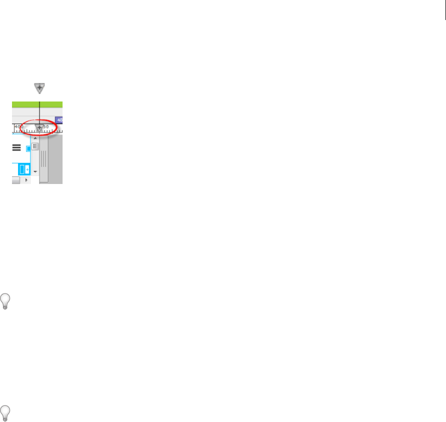
1 Drag the scrubber along the ruler to the required size.
2 Click .
3 In the pop-up that appears, the max-width option is selected by default. To specify min-width or min-max, select
the appropriate option in the drop-down list.
Then, select a CSS source in which the media query must be added.
If you choose to create a new CSS file, another pop-up appears. Specify the name and the path of the new CSS file
and click OK.
To undo, press Ctrl+Z (Win) or Cmd+Z (Mac).
Delete media queries
1 Right-click the corresponding Visual Media Query bar.
2 Click Delete and then click the media query that you want to delete.
3 Click OK to confirm that you want to delete all the media queries and the associated selectors.
To undo, press Ctrl+Z (Win) or Cmd+Z (Mac).
View the code for media queries
1 Right-click the required Visual Media Query bar and hover your mouse on Go To Code.
A list of all media queries in that particular breakpoint range along with the files in the which they are declared
appears.
2 Click the required media query to navigate to the corresponding code in Code View.
If the Code View is not visible, the document is switched to Split view to display the code.
Responsive design using fluid grid layouts
The layout of a website has to respond and adapt to the dimensions of the device on which it is displayed (responsive
design). A fluid grid layout provides a visual way to create different layouts corresponding to devices on which the
website is displayed.